
The task UI is comprised of separate elements, or widgets, that can be added to your task interface. Each element has a unique purpose and settings to support it. As you build the task UI on your project, use these settings to customize the task UI to fit your project.
Types of Elements
There are two main types of elements: display elements and collect elements. Display elements are used to display inputs and other information to contributors, while collect elements are used to collect outputs from your contributors.
—
“Display” Elements
There are five display elements that you can use to surface inputs and other information to contributors within the task UI:DISPLAY ELEMENTS: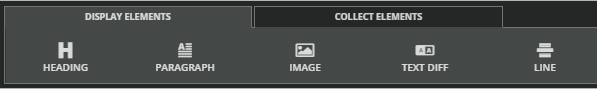
•
Heading
Use the heading element to display a text input, such as an article title, or to label different sections of the UI.
There are two style options: heading and subheading.
Subheadings use a smaller font.
HEADINGS:
You can add a link to a heading element by clicking the “Add link” checkbox. This will display additional fields for “Add a link URL” and “Add link text.”
To use this feature, set an input or static text in both of these fields. Optionally include a heading label.
If you want to display the same URL for each task, you can type in the URL directly. If you want to display a different URL for each task, you can include a URL field in your input file. To create a dynamic reference to this URL, simply put your cursor where you want the input value to appear and click on the appropriate input on the right to add it to the element. You'll see ${InputName} where the input will appear.

Below, see an example that uses static text for the heading label and dynamic inputs for the link text and link url.

Paragraph
Use the paragraph element to display a dynamic text input or other basic lines of text. Just like with the heading above, you can add a dynamic input value to the paragraph element.
PARAGRAPHS: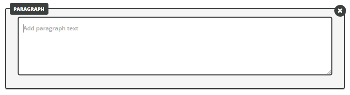
Image
Use the image element to display images within the task UI. You can display static images, or you can display image inputs.
IMAGES:
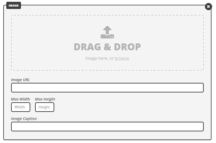
STATIC IMAGES
To display a static image that is the same for every task, upload a file from your computer or provide an image URL.
IMAGE INPUTS
You can also use this element to display image inputs. To do so, simply add the input to the Image URL field.
If your image inputs have accompanying captions, you can display these by adding the caption input to the Image Caption field.
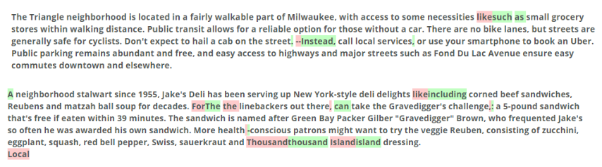
Text Diff
Use the TextDiff element to display the differences between a creator’s original work and the editor’s version.
This element is most useful in the Review Step of a three-step workflow.
To use this element, first add the inputs that you want to compare.
ADD INPUTS TO COMPARE:
Then decide whether you want to compare differences in characters, words or sentences.
COMPARE DIFFERENCES IN CHARACTERS, WORDS OR SENTENCES:
The reviewer will see something similar to "track changes" in MS Word, like this:
REVIEWER'S VIEW:
Line
Use the line element to create a visual separator between other elements within the task UI. There is no other interactive property to the line element, but it does provide you with the ability to visually separate your task UI into sections.
LINE: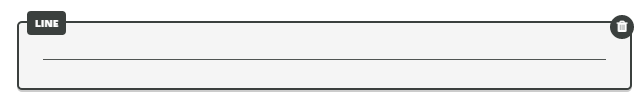
—
"Collect" Elements
There are eight collect elements that you can use to collect information from contributors within the task UI:COLLECT ELEMENTS:

Checkbox
The checkbox element is useful when you want to ask a question that has more than one potential answer.
You can set the minimum and maximum number of answers that contributors can select.
This element is also useful when you need contributors to flag a provided input.
COLLECT ELEMENT: CHECKBOX

•
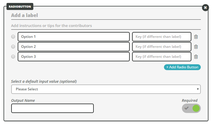
Radio Button
The radio button element is useful when you want to ask a question that has only one possible answer. Similarly to the checkbox element, you can set a separate “key” for each option.
COLLECT ELEMENT: RADIO BUTTON
•
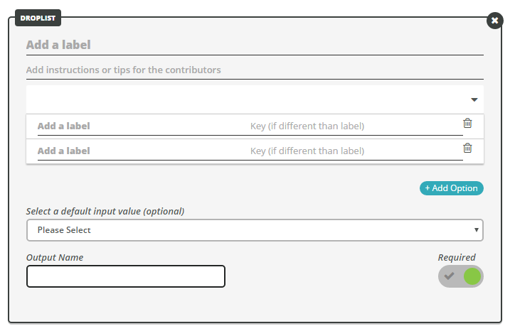
Droplist
The droplist element is an alternative to the radio button that is useful when you want to ask a question that has many answer choices (but only one possible answer). Similarly to the checkbox element, you can set a separate “key” for each option.
COLLECT ELEMENT: DROPLIST
•
Text Area
Use the text area element when you want to collect longer blocks of texts, such as entire paragraphs or articles.
You can also add placeholder content in the text box and set a minimum and maximum word or character count if desired. Note: Setting a minimum required word count will make the field required.
COLLECT ELEMENT: TEXT AREA


•
Text Field
Use the text field element when you want to collect one short line of text or less. You can choose from small, medium and large widths. Additionally, you can choose to allow markdown in the same way as the text area element above.
COLLECT ELEMENT: TEXT FIELD
•
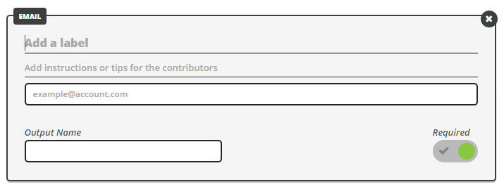
Use the email element when you want to collect an email address. Contributors will only be able to submit text in this field if it contains “@” and a valid extension (.com, .net).
COLLECT ELEMENT: EMAIL
•
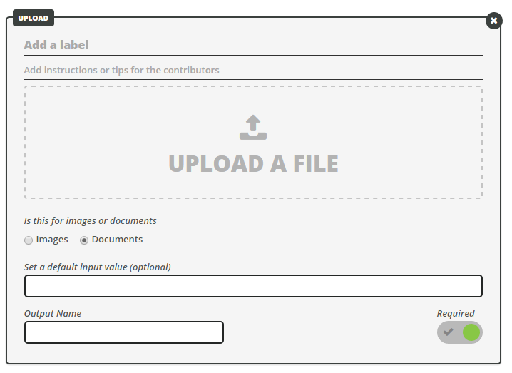
Upload
Use the upload element when you need contributors to provide an image file or document.
COLLECT ELEMENT: UPLOAD
•
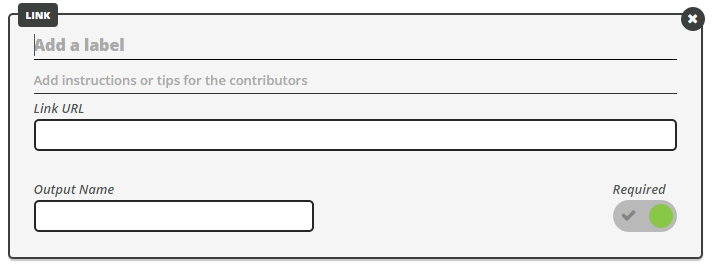
Link
Use the link element when you want to collect a URL. Contributors will only be able to submit text in this field if it begins with http:// or https:// and ends in a valid extension (.com, .net).
COLLECT ELEMENT: LINK
Element Settings
Each element has a number of different settings. The following settings are available on all collect elements:
—
Label
Every Collect element should have a clear, concise label that identifies exactly what the contributor needs to provide in that particular field.COLLECT ELEMENT SETTING: LABEL
Instructions
Collect elements should also have instruction reminders or tips for contributors whenever relevant.COLLECT ELEMENT SETTING: INSTRUCTIONS
Output Name
Every element needs a unique output name. Output names must be unique across all steps of a workflow.For example, if you have a three-step workflow that consists of writing, editing and reviewing an article, you'll need a unique article output for each step:
- article_create
- article_edit
- article_review
OUTPUT NAME
—
Required
Collect elements can be required or optional. Contributors won’t be able to submit tasks until all required elements are complete.SELECT REQUIRED OR OPTIONAL
Learn more about the Task Builder by reading How to Use the Task UI Builder or Designing a Good Task Interface.